top of page

Spotify UI Redesign
A UX case study for Spotify's iOS app
Timeframe : 2 Months
My Role - UX Researcher, UI/UX Designer
The Challenge
I challenged myself to iteratively redesign Spotify, an app with over 180 million users worldwide, to improve its user experience. My goal for this project was to learn as much as possible and to continue motivating myself as I further immersed myself in the design process.
Research: User Interviews and Guerilla Usability Testing
I asked Spotify’s target audience, Millennials and Gen-Z users, to perform a few predefined tasks in the app and asked them about their experiences using Spotify.
Here’s what they had to say:
What are your opinions of Spotify?
"Spotify is my favorite music streaming app but I wish there was more variety in the daily mixes."
"I was never really impressed with Spotify and don’t have it anymore."
"I have never used the Spotify curated playlists because they are not a true shuffle."
"I dislike how it’s always dark mode."
How long does it take you to figure out what you want to listen to?
"A long time. But if I know what mood I'm in it doesn’t take as long."
"I usually listen to music based on my mood so depending on how long it takes me to find something."
How do you find new things to listen to?
"It’s hard to find new things to listen to so usually I don’t and just listen to old music."
"I don't explore new music."
"I ask my friends."
Can you access your payment plan/subscription plan?
"It seems like Spotify tries to hide the payment plan. I can only do it on the web page."
"I truly have no idea how to navigate to the payment plan."
"I can’t switch to a premium account within the app."
Can you find what your friends are listening to?
"I was never able to figure out what my friends are listening to."
Affinity Diagram
Insights from my research was grouped in an affinity diagram which aggregates the needs, wants, and pain points of Spotify users I interviewed.

User Persona
I created a user persona based on the insights gained from my user interviews to help visualize the wants, needs, and frustrations of a typical Spotify target user.

Neilsen's 10 Usability Heuristics
Using information gathered from my research, I selected a few of Nielson’s design heuristics to focus on to improve upon the current design.
Help and Documentation Page
The redesign should allow users to resolve issues with payment, plan, or account within the app rather than be redirected to the web page.
Aesthetic and Minimalist Design
While the design of Spotify is aesthetic and minimalist, my research suggested that there are too many options that create a paradox of choice that ends up overwhelming most users.
Recognition Rather Than Recall
The redesign should make the process of deciding what to listen to easier while simultaneously offering variety.
Flexibility and Efficiency of Use
Improvements can be to allow users to only download one song instead of forcing them to download their entire library or playlist, adding a QR code to easily scan for user profiles, or adding a microphone feature to search for unknown songs.
Information Architecture
Spotify’s current IA ends up overwhelming most users and does not allow them to discover new, creative content. The redesigned IA below condenses various aspects present in the current design while concisely introducing elements based on research that were not present prior.

Designing the Solution
Interaction Design (Low-Fidelity Sketches and Wireframes)
Early sketches
Taking inspiration from the current design, the goal in my early sketches was to incorporate essential features that addressed the users’ wants and needs highlighted through my interviews.
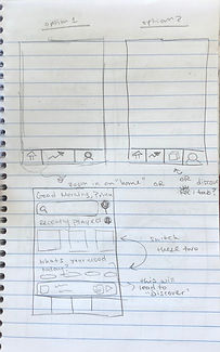


Wireframes
AI turned my early sketches into low-fidelity wireframes. Through user testing I learned that users enjoyed the various features introduced in the redesign.

Visual Design (High-Fidelity Wireframes)
Home page
The current Spotify “Home” page creates a paradox of choice, restricting users from discovering new music. My home page redesign:
-
Cuts down on the amount of content displayed to reduce overwhelming users
-
Includes a carousel of moods to allow users to quickly decide what to listen to based on their mood
-
Incorporates “Friend activity”, a feature already present in the desktop version, for users to discover new music through friends
-
Condenses the “Search” tab for a more minimalist design


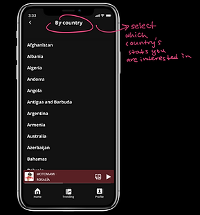
Trending
Here, users can:
-
Listen to songs, playlists, and podcasts trending by country and genre to discover more music variety


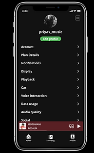
Profile
I revamped the current “Library” tab into a “Profile” tab which:
-
Includes a QR code to easily find other profiles
-
Displays a follower/following count
-
Creates a library separated by songs, playlists, and podcasts. Playlists are split up by ones created by the user and ones liked by the user
-
Includes a “Share Playlist” feature allows for collaboration on playlists
-
Allows individual downloads to give users flexibility of downloading a single track


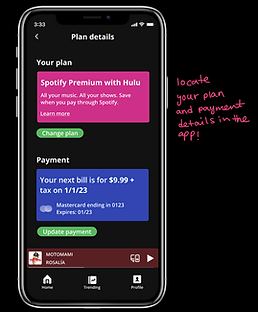
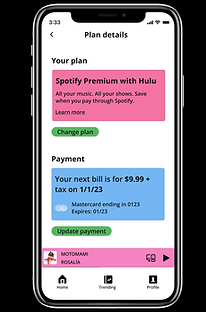
Settings
My settings redesign:
-
Displays “Plan details” which allows users to manage their subscription and payment plan in app
-
Has for more accessibility by allowing users to switch between “Dark Mode” and “Light Mode” or adjust text size


Functional Prototype
I created a functional prototype within Figma. Check it out here.
Validation Testing
To validate the changes I made, I asked users to navigate through the app and perform the same predefined tasks as in my initial user research. My final design received the following feedback:
“I love the listen to by mood. I’ve actually been needing that.”
“I love how easy the payment details are to see.”
“The light mode is sexy.”
“I like how you have the Home Screen organized.”
“I actually really like the way it’s organized. I like the moods of music being on there because sometimes I just want a specific vibe but then I just have to go searching for it.”
“I know a lot of people love the friends aspect of it. I think it’s very smart to highlight that.”
“Love the trending tab.”
Conclusions and Reflections
At the start of this project, I was both excited and nervous to jump right into the deep end of the world of UX. However, I’m proud of myself for teaching myself the concepts of UX design, learning how to navigate Figma, and redesigning Spotify’s UI in a matter of a few weeks. It’s been the most exciting of times learning and iterating to create a design I am proud of. I can confidently say that this is just the start of my journey into UX design. I’m excited to continue delving deeper into the world of UX. I hope you enjoyed reading about my redesign as much as I enjoyed working on it. Thank you for reading!
bottom of page